Architectural folders sit at the intersection of craftsmanship, clarity, and communication. They’re the bridge between a product and the professionals who bring buildings to life. And while brands often feel pressure to innovate, architects still rely heavily on intuitive, tactile, and trusted formats.
So the challenge becomes: How do you push design forward without pushing architects away?
Below is a practical look at how to strike the right balance—adding just enough innovation to elevate the experience while preserving the simplicity that architects count on.
Start with What Already Works
Innovation in architectural folders isn’t about reinventing the entire format. In fact, the foundation should stay almost entirely unchanged. Architects have long-established methods for reviewing building product samples, comparing options, presenting selections to clients, and storing information.
If something is already familiar and functional, it should be respected.
The smartest innovations come as subtle enhancements. Think of them as small “value boosters” that improve clarity or ease without altering the architect’s natural workflow.
The Interactive Elements That Get It Right
Features that enhance the experience do so by integrating seamlessly into existing habits. These are what we mean by subtle enhancements:
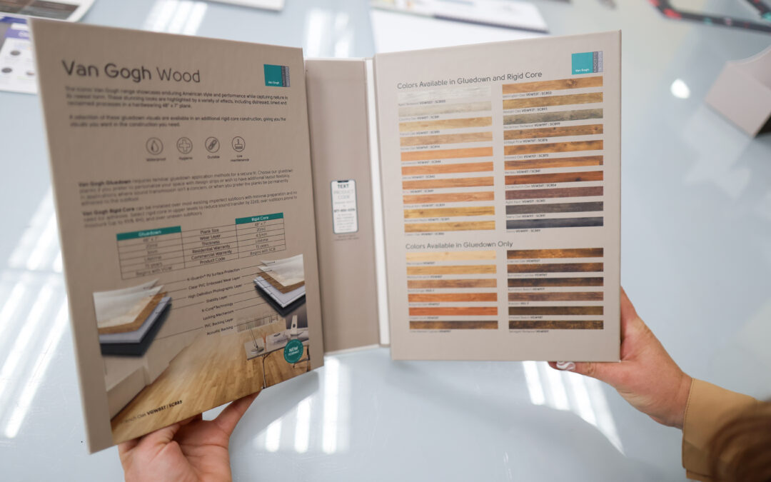
Tactile Samples
No level of digital innovation replaces the need to touch and feel a product. Tactility remains the core of architectural decision-making.
The key is pairing that tactile piece with an adjacent informative element—like a foldout or insert—so architects don’t have to rely on memory or secondary notes. Everything they need lives in one compact, cohesive system.
Foldouts
Architects respond well to foldouts because they expand the available space for content without disrupting the format. A folder can still contain the expected tactile samples and core information, while a foldout:
- Adds extra visuals or specs
- Provides context around new products
- Sits neatly beside the physical sample for immediate comparison
- Can be updated or replaced easily when product lines change
This is innovation that feels intuitive rather than intrusive.
QR Codes and Digital Complements
QR codes strike the perfect middle ground: tech-forward but universally understood.
They can:
- Connect to videos
- Provide specs
- Showcase interactive design tools
- Display updated product data or colors
And because they’re optional, architects who prefer to stay analog aren’t forced into digital workflows. The folder works with or without tech.
Future-Proofing Without Rebuilding
One smart innovation strategy is designing folders with modular components. For example:
- A core folder structure stays the same
- Interchangeable inserts or foldouts can be refreshed as needed
- New colorways or updated specs can be swapped in without scrapping an entire batch
This approach protects budgets, prevents waste, and keeps materials current, all while maintaining familiarity.
When Innovation Goes Too Far
There is such a thing as overdoing it. Pushing beyond subtle enhancements can lead to:
1. Information Overload
If the folder becomes too complicated—too many flaps, layers, gimmicks, or visuals—it stops communicating and starts confusing.
Architects shouldn’t have to decipher the folder before they can evaluate the product.
2. Distraction From the Product
Innovation should elevate the product, not overshadow it. If the design steals attention from the material sample itself, the folder has defeated its purpose.
3. Mechanical Failure
More hinges, folds, closures, or built-in tech means more points of failure. A folder shouldn’t require charging, repairing, or replacing. If it’s too fragile or complex, longevity and brand perception suffer.
Foundational Elements That Should Never Change
Some aspects are non-negotiable because they anchor trust:
Premium Materials
The physical feel of the folder sets the tone before it’s even opened. A flimsy folder paired with a premium product sends mixed signals. The materials need to reflect the quality of what’s inside.
Tactility
No digital tool replaces the need for physical material samples for architects. They remain one of the most influential tools in architectural decision-making and should never be compromised.
Clarity and Readability
Crisp imagery, accurate colors, clean infographics, legible copy, and high-resolution photography are core components of credibility.
The Sweet Spot
Architectural folders aren’t meant to be futuristic devices. They’re tools: functional, tactile, durable, and intuitive. The most effective innovations are those that feel like natural extensions of what already works. Learn more about our architectural folder capabilities and help your brand win the moment.